Showing posts with label Giotto. Show all posts

Friday, December 10, 2010

Eternal Life: Italian Mosaics of the First Christian Millenium


According to Giorgio Vasari’s Lives, Domenico Ghirlandaio—whose frescoes graced the walls of the Sistine Chapel before those of his apprentice, Michelangelo—once called the art of mosaics as “vera pittura per l’eternita” or “true painting for eternity.” Joachim Poeschke’s Italian Mosaics: 300-1300 demonstrates the seemingly eternal life of these pre-Renaissance mosaics, which contain some of the earliest images of Christian art. In this first published survey of the subject, Poeschke analyzes how religion and politics teamed up to produce these glories of artistry in words while allowing stunning photographs of the mosaics to speak for themselves. Please come over to Picture This at Big Think to read more of "Eternal Life."

[Image: Enthroned Madonna and Child between Angels. Nave, north wall. Sant’ Apollinare Nuovo, Ravenna, Italy. Nave, Circa 500 and 560.]


[Many thanks to Abbeville Press for the image above and for a review copy of Italian Mosaics: 300-1300 by Joachim Poeschke.]

Friday, January 8, 2010

Man of the Century


Quick Quiz: Who is the only artist to be named “man of the century”? Picasso? Did Demoiselles d'Avignon and Guernica preach love and peace to define the twentieth century? I wish they did, but, sadly, no. You have to go back all the way to the fourteenth century to find TIME Magazine’s “Man of the 14th Century,” as named in their 1999 end-of-the-millennium roundup. By painting people three-dimensionally and more humanly than ever before, Giotto di Bondone started a revolution that no artist has equaled since. Will any, can any, ever top Giotto, who died on this date in 1337? (Giotto’s The Arrest of Christ, also known as The Kiss of Judas, one of the scenes of the life of Christ painted in the Cappella Scrovegni from 1304 through 1306, appears above.) Please click over to Picture This at Big Think to read more of "Man of the Century."


Wednesday, June 3, 2009

The Fast and the Furious


In his prime, friends and fellow painters called Jacopo Comin, better known as Tintoretto (or the “little dyer” after his father’s occupation as a dyer), Jacopo Robusti (“the robust one”) or Il Furioso for his seemingly endless store of furious energy. Until his death on May 31, 1594, Tintoretto painted scenes of ancient gods and the Christian God like he had made a pact with the devil instead. Jacopo’s father reportedly took Tintoretto to study under Titian, but the Old Master never took Jacopo as a student, either, as the legend goes, out of fear of being outdone by a student or, more likely, out of fear of unfairly influencing a unique talent. In Venus, Mars, and Vulcan (above, from 1551), Tintoretto paints a classical tale in Titian-like style but with his own sense of humor mixed in. The cuckolded Vulcan rushes into room to confront Venus as Mars hides under the table and Cupid feigns both sleep and innocence. Tintoretto paints the very moment of tension before Venus’ dog barks at Mars in his hiding place and the fur really begins to fly. It’s truly amazing just how much energy Tintoretto could inject into any scene, even one as well-known and over-painted as this classic love triangle. With humor and humanity, Tintoretto speeds up the film and gets the action started.


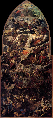
Above his studio door, Tintoretto inscribed “Michelangelo's design and Titian's color.” Titian certainly knew Michelangelo’s 1541 fresco of The Last Judgment and didn’t flinch from the idea of drawing a comparison, just as Michelangelo himself had strove to do Giotto one better. Tintoretto’s The Last Judgment (above, from 1560-1562) stands more than 47 feet high; Michelangelo’s version comes in at a hair under 45 feet. In that slightly larger space, Tintoretto inserts more souls per square foot than his predecessor. Also, Tintoretto depicts the figures greatly foreshortened. Standing at the base of the painting you get the feeling that they are about to fall down on you, as if you had just opened a giant closet door and the entire apocalypse was crammed inside. Giotto’s Last Judgment is pure, coherent order; Michelangelo’s version is complexity masquerading as chaos; but Tintoretto’s take is chaos covering more chaos—perhaps the best rendition of how the final reckoning will actually look to human eyes, if that day should ever come. Perhaps there’s a method to the madness of Tintoretto’s Last Judgment, but the teasing out of the rationale is beyond me. Like so many people trying to keep up with Tintoretto, I just don’t have the energy.


When fires destroyed the decorations of the legislative meeting rooms of the Doge’s Palace, Tintoretto created his largest and last blockbuster, titled with deceptive simplicity, Paradise (detail above, from 1587-1590; see the whole thing here). At 74 feet wide and 30 feet tall, Paradise may be the largest canvas painting ever made. With the help of his son Domenico, the 70-year-old but still spry Tintoretto painted the work and installed it in the room. In the center, Jesus and the Virgin Mary serve as the still center around which hundreds and hundreds of saints radiate out. With Paradise, Tintoretto finishes the job he began with his Last Judgment, showing you the final results, as it were. As with Tintoretto’s Last Judgment, Tintoretto’s Paradise defies easy summation and bursts beyond our ken. One can only wonder what went through the minds of Italian politicians over the years as they deliberated with Tintoretto’s masses teeming on the wall and passing judgment on them as they pass judgment on others. Sadly, Tintoretto’s career is colored by his big thinking and painting. You simply can’t wrap your mind around these works. I suspect that Tintoretto’s point isn’t to stop and think as much as to look and learn, and always, always keep moving.

Monday, May 18, 2009

The Dark Ages


Any adult who has received a Catholic education and survived will have plenty of “interesting” stories to tell of the more mystical or, as we liked to call them, weird aspects of the faith, which were usually remnants of the theology born during the time not so affectionately known as the Dark Ages. (They prefer the Middle Ages now.) Domenico di Pace Beccafumi, better known simply as Il Beccafumi, died on May 18, 1551, as the Dark Ages were giving way to the enlightening humanism of the Renaissance. Born 1486, Beccafumi, whose name translates roughly as “catching smoke,” painted the dark, smoky Self-Portrait above around 1525, at the height of his career. Little did he suspect that he was one of the last of his kind, the last of Mannerist painters of the Sienese School of Il Sodoma and others. For modern art lovers, the Florentine School stretching from Giotto to Michelangelo and Botticelli overshadows the work of their Sienese cousins, but the art of the Sienese Mannerists, particularly that of Beccafumi offers us a glimpse of the medieval Catholic mind.


Perhaps the most repulsive of all the torture-centered saints is Saint Lucy (above), painted by Beccafumi in 1521. It was common to portray saints with some token of the method of their martyrdom. Even Michelangelo’s Last Judgment shows several saints in the circle around Christ brandishing the weapons of their own destruction. Because legends has it that Saint Lucy’s eyes were gouged out before her execution, she is often shown holding her eyes. Because she’s holding the eyes, or other times (as here) displaying them on a plate, while the eyes in her head are restored, I was confused as a child as to whose eyes she was actually serving up for our viewing, uh, pleasure. The gruesomeness of this imagery emphasized the physicality of the saint’s suffering to a mostly illiterate church-going population. In an age of plagues and all-around short life expectancy, suffering was the common coin of life, the language people understood easiest. Saint Lucy’s eyes to my modern eyes seemed grotesque, whereas the eyes of a sixteenth-century boy may have recognized them as par for the course.


It’s hard for us to step into the shoes of Beccafumi and think like him and the people he worked for because we live in a post-Renaissance, humanist world (or at least like to think we do). We just don’t see ourselves as fallen into sin as Beccafumi’s time did. Beccafumi’s Christ in Limbo (above, from 1530-1535) shows Christ’s Harrowing of Hell during the time between the Crucifixion and the Resurrection. Today, the idea of Christ’s Harrowing of Hell and his visiting of the good, but unbaptized souls relegated to Limbo seem politically incorrect in our polytheistic world. Beccafumi might have sensed the unfairness of this doctrine of the early church by sympathetically portraying the souls approaching Christ and asking for redemption. Beccafumi unbalances the composition by outweighing Christ on the left with the abundance of dead on the right. Christ’s expression mixes both compassion and almost surprise at how death had undone so many. Yet, in Beccafumi’s world, rules are rules. Christ’s crucifixion opened the gates of Heaven for the Old Testament saints awaiting that redemptive moment, but for the unbaptized remainder, nothing could save them from a life of aimless limbo. My bleeding liberal’s heart would have made me a bad Medieval man, but I really should judge Beccafumi’s theology since I don’t know how I would have acted in his time and place. Beccafumi’s art is truly a glimpse into another worldview at the near the very end of its reign.

Thursday, March 26, 2009

In the Cards


One of the most daunting challenges for anyone wanting to know more about art is deciding where to start. What are the best books to read? Who are the artists you need to know? What paintings should you know first? Masterpiece Cards rides to the rescue of students and art lovers everywhere with their concise collection of 250 cards featuring the greatest paintings from the Renaissance to the 1960s. Masterpiece Cards took forty books on art history and combed their 17,000 pages for the names of paintings from that time span. They collected those names in a database and picked out the 250 works appearing the most often, thus generating a list of greatness as fair as any other. With beautiful quality reproductions and informative text on the rear, each card is a short lesson in art history.


For anyone familiar with art history, these cards will seem like mementos of old friends, such as David’s Oath of the Horatii (above, from 1784). On the reverse, text from one of the references used gives useful insights into the work and its place in the course of art history. A color-coded system at the top indicates where each painting is located, so if you’re headed to France, just grab those marked “France” and let the adventure begin. For students, these make the ultimate “flash cards” of art appreciation class. The information on the back allows you to arrange them in any order you wish—chronologically, nationally, or simply by artist. The text-free fronts will help those using the cards to build up a visual memory of the greats.


Masterpiece Cards has done a great job of avoiding many of the pitfalls of list-making in art. (A full list of the 250 paintings appears here.) Limiting the time frame from the Renaissance to the 1960 means saying no to Giotto, sadly, but also means steering clear of the Damien Hirsts of the contemporary scene, which seems like a fair trade to me. To avoid having a Picasso or Van Gogh take up too much space with their many masterpieces, Masterpiece Cards limited each artist to no more than three masterpieces. Although they’ve culled their choices from long-revered backbreaking tomes such as Janson’s, Arnason’s, and Gombrich’s histories, Masterpiece Cards avoided the trap of sexism, making sure to include obvious (such as Mary Cassatt) as well as not so obvious (the undervalued Helen Frankenthaler) female artists. The choices center almost exclusively on American and European artists, but that reflects the reference books more than any bias on the card-makers’ part, I believe. For better or worse, these cards should work with art history education first and foremost, building the foundation that the student can later tear down as they explore further the art of women, minorities, and non-Western cultures.

Most students today might prefer the easy access of online searches, but, just as e-books can’t replicate the satisfaction of their paper ancestors (at least in my opinion), there’s something satisfying with having these cards in hand. I remember growing up as a kid and having my parents give me the sample Time-Life cards that used to come in the mail to entice you to buy the whole set of cards offering all that is known on the animal kingdom, world history, etc. Ever the inquisitive kid, I used to marvel at those scraps of knowledge, even if the pudu or Council of Trent seemed like lonely facts separated from their laminated brethren. To flip through these cards, handle them, and rearrange them provides the ultimate initial hands-on experience for the young mind soaking in these images and ideas for the first time. As both a educational tool and source of entertainment, Masterpiece Cards are the real deal.

[Many thanks to Masterpiece Cards for providing me with some sample cards for review and for the images above.]

Friday, January 9, 2009

The Man in the Arena


"It is not the critic who counts; not the man who points out how the strong man stumbles, or where the doer of deeds could have done them better. The credit belongs to the man who is actually in the arena, whose face is marred by dust and sweat and blood; who strives valiantly; who errs, who comes short again and again, because there is no effort without error and shortcoming; but who does actually strive to do the deeds; who knows great enthusiasms, the great devotions; who spends himself in a worthy cause; who at the best knows in the end the triumph of high achievement, and who at the worst, if he fails, at least fails while daring greatly, so that his place shall never be with those cold and timid souls who neither know victory nor defeat."

From
The Man in the Arena speech by Theodore Roosevelt, delivered April 23, 1910

At the edge of the shadowy beginnings of the Italian Renaissance stands a giant—Giotto, who died on January 8, 1337. Born around 1267, Giotto’s name now rings with the almost inhuman divinity of Praxiteles or Zeuxis, thanks mainly to the early mythmaking of Giorgio Vasari in his Lives of the Artists. Vasari tells of Cimabue discovering Giotto as a young shepherd drawing his sheep on a rock. Later, taking a page from the legend of Zeuxis, Giotto (according to Vasari) painted a fly so realistic that Cimabue tried to shoo it away. Behind the myth of Giotto, however, remains the reality of his groundbreaking realism, which departs sharply from the Byzantine style of Cimabue and two centuries of art before Giotto’s heyday. Although many works once ascribed to Giotto are now disputed, the frescoes of the Scrovegni Chapel in Padua, also known as the Arena Chapel (shown above from the entrance, from 1303-1306) bear Giotto’s signature, a clear sign of pride in his mammoth accomplishment. Like Roosevelt’s “man in the arena,” Giotto knew victory and defeat, yet continually burned with the passion to strive valiantly through error into what Vasari and others judged as perfection.


There are so many great frescoes in the Arena Chapel that it’s hard to pick a few to talk about. (A nice selection of images of the frescoes can be found here.) One of the most moving for me, as a Christian, is Giotto’s depiction of the Resurrection, also known as Noli me tangere (above, from 1304-1306). It’s amazing to think of such colors surviving seven centuries. Even though Giotto paints the supreme supernatural event of Christianity, he infuses it with his signature realism and humanity. Mary Magdalene gives in to her instinctive impulse to touch the risen Christ, disbelieving her eyes, but Jesus pulls away and tells her, “Do not touch me.” Whereas Mary Magdalene and the sleeping soldiers wear earthy reds and browns, Christ and the angels wear white with golden accents and almost fade away into nothing as Christ freshly assumes his heavenly aspect and begins to leave the physical world behind. The stylized Christ of the Byzantine period now becomes a Christ who walks among real people, thus reaffirming the promise of the Incarnation lost in the Dark Ages and pointing forward to the humanism of the Renaissance.


Before Michelangelo painted his Last Judgment, he studied Giotto’s, placed at the end of the Arena Chapel (above, from 1306). (Better pictures of details of Giotto’s Last Judgment appear here.) We know Michelangelo visited the Arena Chapel and looked closely at the frescoes because some of his studies of those works still exist. Giotto’s vision of the final days must have captured Michelangelo’s imagination and planted a seed that took root decades later when the opportunity arose to cap off his monumental achievement in a different chapel that would become synonymous with his name. A contemporary of Dante, Giotto most likely knew of Dante’s Divina Commedia and its mind-blowing conception of Hell. Giotto creates a visual equivalent to Dante’s Inferno in the lower right corner of his Last Judgment that borders on Hieronymus Bosch in perversity, yet predates Bosch by almost a century and a half. The more you look at Giotto’s work the more he seems like a time traveler, skipping ahead to see what’s ahead and then darting back to his own time to paint it. As much as Vasari overindulged in the farfetched in his Lives, Giotto more often than not manages to live up to the myth.